Introduction
GrapplingArc was built to work outside mainstream approaches, rejecting models that rely on pressure, exploitation, or blind conformity. Our visuals are intentional, reflecting a methodical approach to preparation which blends traditional elements with modern ones.
The website
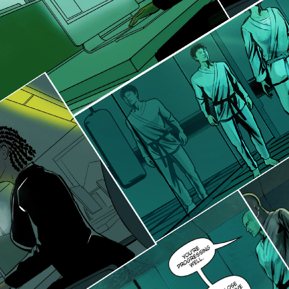
Visual structure is part of our communication. Layout, spacing, and color are used to reduce noise or stimulation. We avoid imagery of blood, crowds, and spectacle. Those belong to competition. This space is for what comes before it: introspection. The primary color reflects that choice. Dark greenish–blue keeps the environment calm and neutral. The color sits between green and blue by design. It doesn’t have clear classification, just like many of the internal material fighters deal with under pressure.

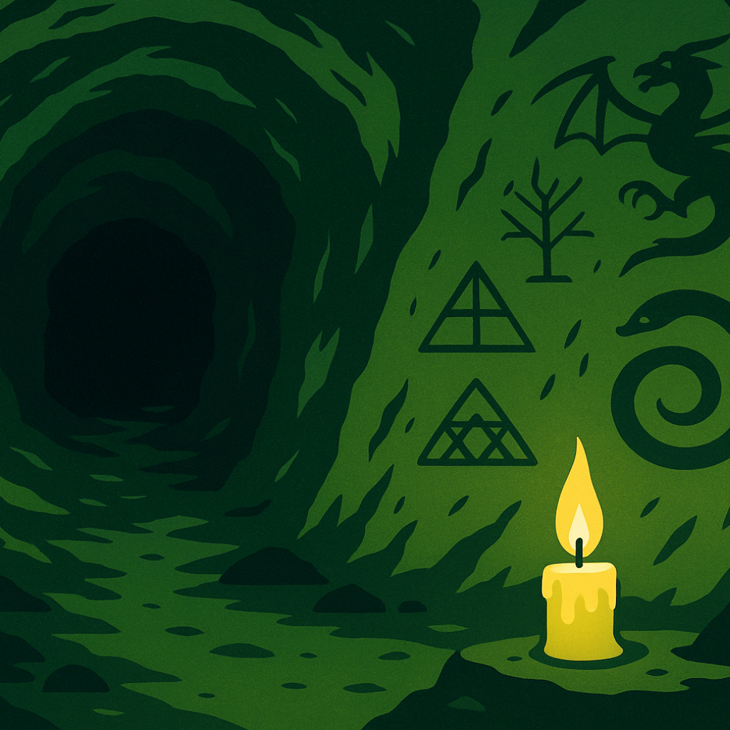
Accent colors are used sparingly. They signal action, direction, or emphasis. If something stands out, it is meant to be read or used. Yellow marks instructions, or critical points, where attention needs to go. It symbolizes conscious awareness. A softer green signals action. Putting them together draws the image of a mossy cave with a flickering candle, a space to gather resources before stepping out.
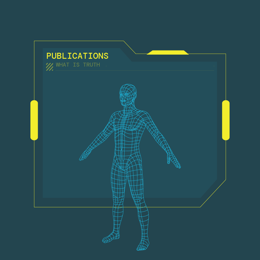
The layout also reflects this logic. Asymmetry, line icons, and technical-style illustration guide reading without overload. Creating a platform that is transparent and supports preparation without asking belief or emotional buy-in.
The dragon artworks
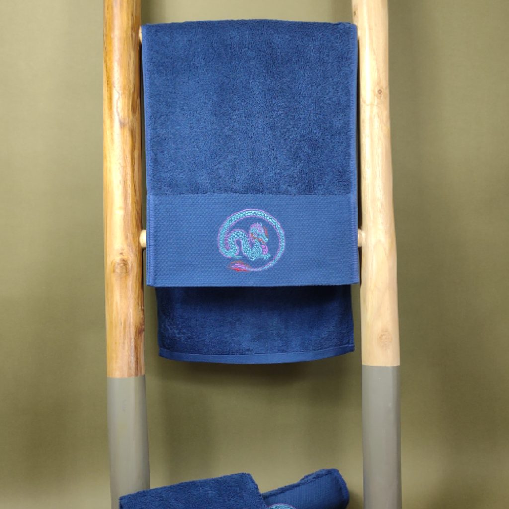
The dragon is central. Chosen for its archetypal meaning, it represents the shadow work. Unlike familiar animals, the dragon is undefined, all its features as speculative. That’s where the fight begins. Our dragons mix Eastern linocut, representing intuition, with Western layout, representing scientific precision. Neither could give a full picture alone.
We have two dragons for a reason. The green dragon represents the internal work, defining boundaries, building brain-body connections. The other’s external: protecting resources and claiming territory. Training stays inside. Competition pushes you out. That’s the shift.
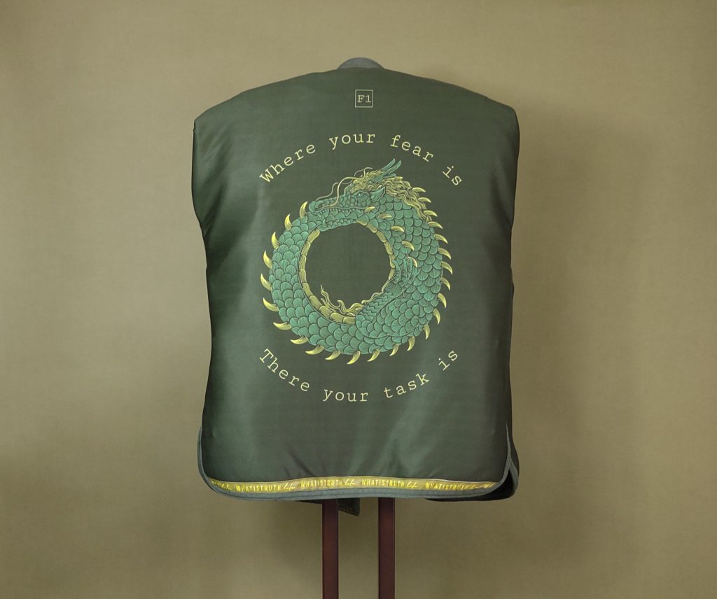
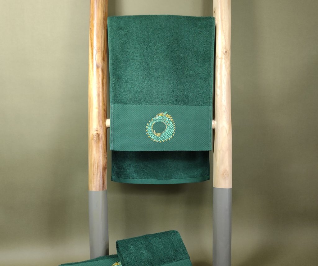
Dragon of growth – Ouroboros
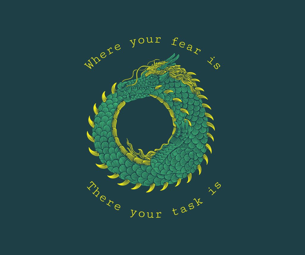
The Ouroboros dragon, knows for biting its own tail, symbolizes cyclic development. It’s the work training throws you into. Progress isn’t linear, it goes stage by stage. One round of self-work, a pause, then another. Each cycle adds awareness, governance, and skill. That’s what the ouroboros shows: how the cycles moves you forward.
The raw stuff, the anger, the confusion, the doubt, gets transformed cyclically. You turn it into something you can use: awareness, focus. That’s your edge. Your Magnum Opus, being whole enough to use every part of yourself without any being denied or labelled as broken.
The green color of the Ouroboros dragon’s body marks both immaturity and potential, the beginning stages of maturity. Its yellow spikes are basic defenses, represent rationalization, imperfect tool, just enough to get by.
In some places, we display the dragon alongside a quote from C.G. Jung:
“Where your fear is, there your task is.”
This serves as a reminder that the shadow is not silent. Follow your emotional charge, it holds the lessons learnt and point the walls to break down.
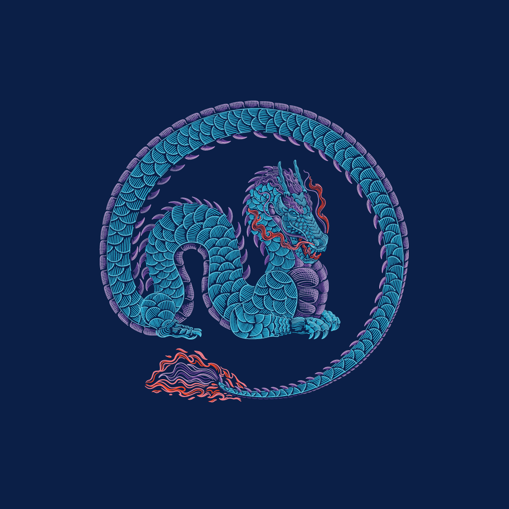
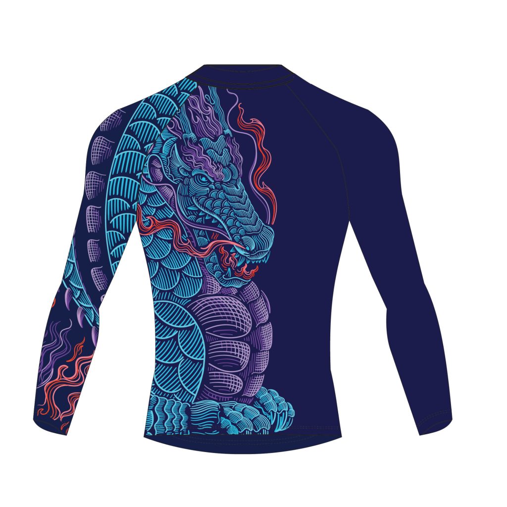
Dragon of readiness – Blue dragon (with no specific name)
The blue dragon represents the work done. What used to drain energy is now under control. By competition time, resentment and fear has been processed through training, what’s left is awareness and integrity. The coiled tail means containment. Nothing gets in. Nothing leaks for free.
The blue of the body signals calm. The red fire marks drive and intent flowing freely. Inner power that shows in posture, breath, and how little you need to move.
Closing Thoughts
That’s why visuals matter. Color, shape, and contrast communicate multi-layered ideas better than words alone. The GrapplingArc visual systems with its colors, forms, and symbolism, serve as a parallel communication layer, tells the story for those who know how to read it.


